Siawsh Blog: The Ultimate Guide to the 7 Types of Logos! From Beginner Basics to Pro-Level Branding
- siavash afsari
- Jun 27, 2025
- 6 min read


A logo is the face of your company. It’s the silent ambassador that works for you 24/7, making a first impression in a fraction of a second. But not all logos are created equal. The type of logo you choose is a strategic decision that can shape public perception, build brand recognition, and communicate your core values.
Whether you're a startup founder sketching on a napkin or a seasoned marketer considering a rebrand, understanding the different types of logos is crucial. In this guide, we'll break down the seven primary logo categories, explaining each from a beginner's perspective and then diving into the professional strategy behind them.
Let's decode the DNA of design.
1. Monogram Logos (or Lettermarks)

Beginner's Explanation: A monogram is a logo made from a company's initials. Think HBO (Home Box Office) or NASA (National Aeronautics and Space Administration).
Professional Deep Dive: Lettermarks are the go-to solution for brands with long, complex, or hard-to-pronounce names. By condensing the name into initials, you create a simple, memorable, and highly scalable brand identifier.
When to Use It: Your business name is a mouthful (e.g., International Business Machines becomes IBM). You're in an industry where simplicity and efficiency are valued (e.g., tech, law, government). You want a clean, modern, and timeless feel.
Key Consideration: Typography is everything. The font you choose must be legible and reflect your brand's personality—be it elegant, modern, or powerful. The negative space and interplay between the letters are critical design elements.
Famous Examples: HBO, IBM, NASA, Louis Vuitton (LV).
2. Wordmarks (or Logotypes)
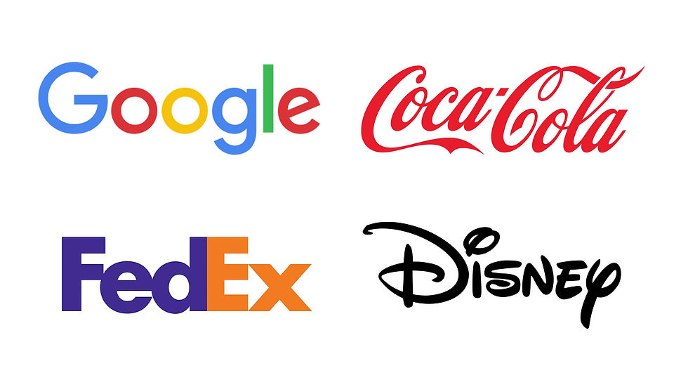
Beginner's Explanation: A wordmark is a logo that is just the full name of the company, but designed in a unique, stylized font. Think Google, Coca-Cola, or Visa.
Professional Deep Dive:Wordmarks are powerful because they directly link your visual identity to your brand name, which is excellent for building name recognition. This approach works best for companies with distinct, relatively short names.
When to Use It: You're a new company and need to get your name out there. Your company name is catchy and memorable. You want a straightforward, no-fuss identity that feels accessible and confident.
Key Consideration: Just like with lettermarks, the font is the star. A custom typeface can make your brand completely unique (like Coca-Cola's script). The color, kerning (spacing between letters), and style must be meticulously crafted to stand the test of time and convey the right emotion.
Famous Examples: Google, Coca-Cola, FedEx, Disney.
3. Pictorial Marks (or Brand Marks)

Beginner's Explanation: This is a logo that is a simple, recognizable icon or graphic. It’s a literal representation of a thing. Think of the apple for Apple or the bird for Twitter.
Professional Deep Dive:A pictorial mark is a powerful branding tool, but it's a long game. It relies on the image alone to be recognizable. When a brand achieves this level of recognition, its mark becomes a potent, language-agnostic symbol.
When to Use It: You're an established brand aiming for global recognition. Your brand name is directly associated with a tangible object (e.g., Apple, Shell). You want to convey a specific idea or emotion instantly.
Key Consideration: The chosen image must be simple, scalable (it needs to look good on a pen and a billboard), and unique enough to avoid confusion with other brands. For new businesses, it's often wise to launch with a combination mark (icon + name) and phase out the name as brand recognition grows.
Famous Examples: Apple, Twitter, Target, Shell.
4. Abstract Logo Marks

Beginner's Explanation: An abstract mark is like a pictorial mark, but instead of being a recognizable object, it's a custom, conceptual geometric shape. The Nike "Swoosh" is the most famous example.
Professional Deep Dive:Abstract marks are the ultimate in custom branding. They allow you to create a completely unique visual that conveys a feeling or a big idea without relying on a literal image. The Nike Swoosh represents motion and speed; the Pepsi globe represents... well, it has evolved, but it's uniquely Pepsi.
When to Use It: You want to communicate a complex idea or feeling in a single visual. You're in a competitive or innovative industry (like tech or sportswear) and need to stand out. You want a truly unique and ownable brand asset.
Key Consideration: Because the shape has no pre-existing meaning, you have to invest heavily in marketing to teach consumers what it represents. The design must be strong enough to carry this weight. Color psychology plays a massive role here.
Famous Examples: Nike, Pepsi, Adidas, BP.
5. Mascots
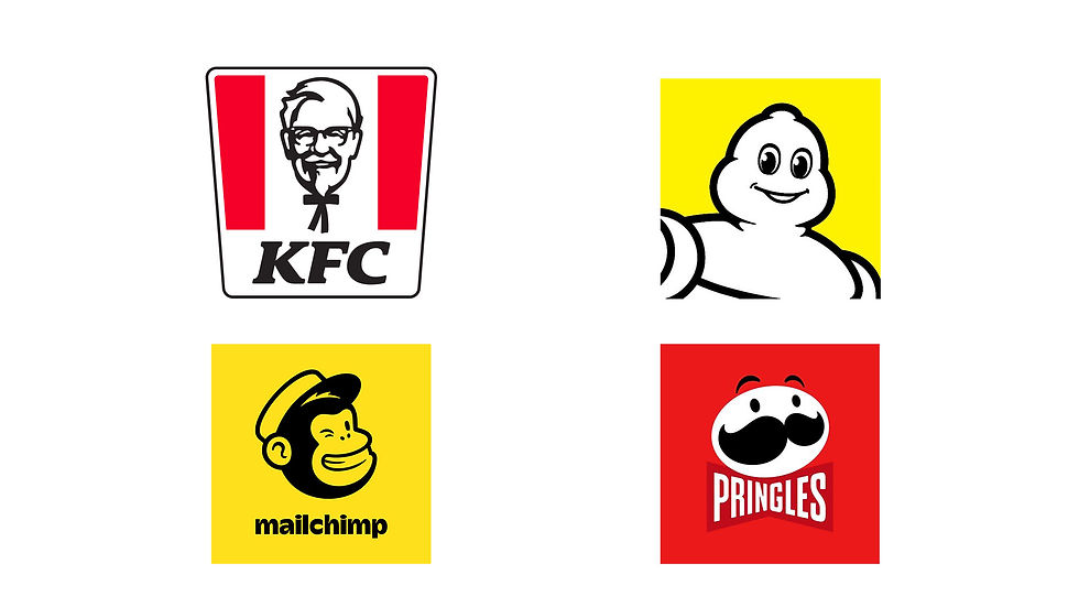
Beginner's Explanation: A mascot logo is a logo that features an illustrated character. This character acts as a "spokesperson" or ambassador for the brand.
Professional Deep Dive:Mascots are excellent for creating a friendly, approachable, and family-oriented brand personality. They are highly engaging and can be adapted for various marketing campaigns, from animations to real-life appearances.
When to Use It: Your target audience is families or children. You want to create a fun, welcoming, and positive brand image. You want a flexible brand character for marketing and social media.
Key Consideration: The character's design must align with your brand's tone and values. A poorly designed or outdated mascot can quickly become a liability. Mascots can also be less "serious" or "premium," so they aren't suitable for all industries (e.g., a high-end law firm).
Famous Examples: KFC's Colonel Sanders, The Michelin Man, Pringles' "Julius Pringles," Mailchimp's "Freddie."
6. The Combination Mark
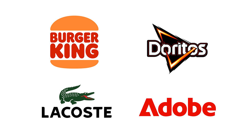
Beginner's Explanation: This is the best of both worlds: a logo that combines a wordmark or lettermark with a pictorial mark, abstract mark, or mascot.
Professional Deep Dive:The combination mark is the most popular choice for a reason: it's versatile, clear, and effective. The text reinforces the image, and the image reinforces the text, creating a strong, cohesive brand identity. This helps consumers associate your name with your symbol from day one.
When to Use It: For almost any business, especially new ones. It provides the clarity of a wordmark with the visual interest of a symbol. It gives you the flexibility to use the icon and text together or separately as brand recognition grows.
Key Consideration: The balance between the text and the icon is crucial. They must feel like they belong together, not like two separate elements forced into one space. The design should be harmonious in scale, style, and weight.
Famous Examples: Burger King, Doritos, Lacoste, Adobe.
7. The Emblem

Beginner's Explanation: An emblem is a logo where the company name is inseparable from a shape or icon, like a badge, seal, or crest.
Professional Deep Dive:Emblems have a traditional, established, and classic feel. They often communicate longevity and high quality, which is why they are popular with schools, government agencies, and auto companies. They create a compact and impactful design.
When to Use It: You want to project a sense of tradition, heritage, and authority. Your brand is in an industry that values these qualities (e.g., automotive, universities, coffee, beer).
Key Consideration: The primary challenge with emblems is scalability. Because the text and icon are intertwined, the details can become illegible when shrunk down for small applications like app icons or favicons. A modern emblem must be designed with simplicity in mind, or a secondary, simplified version may be needed.
Famous Examples: Starbucks, Harley-Davidson, Harvard University, Warner Bros.
Choosing the Right Logo for Your Brand
A logo isn't just art; it's a strategic tool. The right choice depends on your:
Brand Name: Is it long or short? Unique or common?
Industry: What are your competitors doing? Do you want to fit in or stand out?
Target Audience: Who are you trying to connect with?
Brand Personality: Are you playful and fun, or serious and sophisticated?
Conclusion: Your Logo is Your Foundation
Understanding these seven logo types is the first step toward building a powerful visual identity. Each has its own strengths and strategic implications. The most iconic brands in the world chose their logo type with purpose—and so should you.
Feeling inspired but not sure where to start? A logo is one of the most important investments you'll make in your business. At [Your Company Name], we specialize in crafting strategic, memorable logos that tell your brand's story.
[Contact us today for a free consultation, and let's build the face of your brand together.]
Helpful Resources for Further Research
For Inspiration:
Dribbble: A showcase of work from designers and creative professionals around the world. Excellent for seeing current trends.
Behance: Adobe's portfolio platform, featuring in-depth case studies on branding projects.
LogoLounge: A subscription-based site with a massive, searchable database of logos from top designers. They also publish excellent trend reports.
For Education & Theory:
"Designing Brand Identity" by Alina Wheeler: The definitive guide to branding, covering everything from research to application.
Brand New (UnderConsideration): A blog that provides chronicles and opinions on corporate and brand identity work. A must-read for professionals.
Smashing Magazine: Offers high-quality articles on design, including deep dives into logo design theory and practice.
#GraphicDesign #LogoDesign #siawshco siawsh.co #Marketing #Branding


Comments